FOOD TRUCK BRANDING
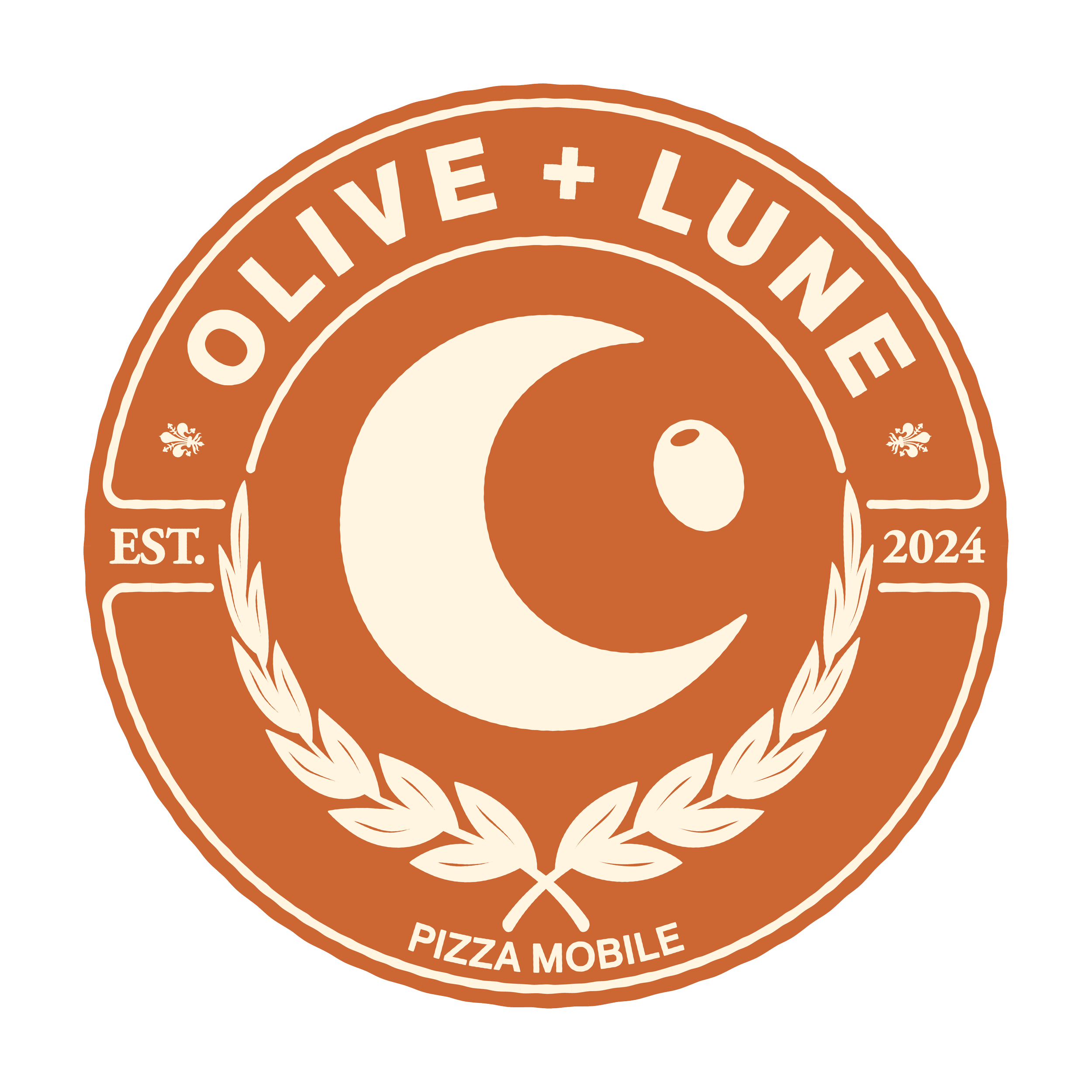
The scenario here was to create the whole branding for a food truck. Olivia and Luna are a couple who want to make their dream of running a pizza food truck and they hire me to develop the branding for it. The name for their business is Olive & Lune (Olive and Moon) to represent both of their names. Olivia is born and raised in Montréal and is the visionary cook in the duo. Luna comes from the Tuscany region and brings a traditional touch to the food. (those are all qualities they want to be reflected in the branding)
Aside from the obvious moon and olive, the logo goes deeper than that. First, the switch of “&” in the name to a “+” gives a strong modern contrast with the emblem logo that reflects a very traditional type of storytelling. Second, the main font is called PP Neue Montreal (heavily inspired by Helvetica, used during the Expo ‘67 event). The secondary font is Garamond (Claude Garamond was influenced by the Italian typographic designs of the time).

Finally, the lily flower on each side of the name. It was a very happy accident but this flower is both the symbol of Québec as well as the city of Florence (located in the Tuscany region of Italy)
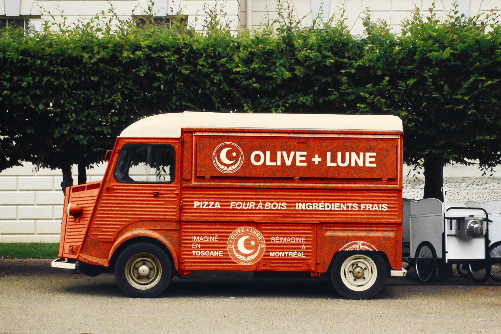
Middle: Pizza, Wood oven, fresh ingredients. Bottom: Imagined in Tuscany, Reimagined in Montreal
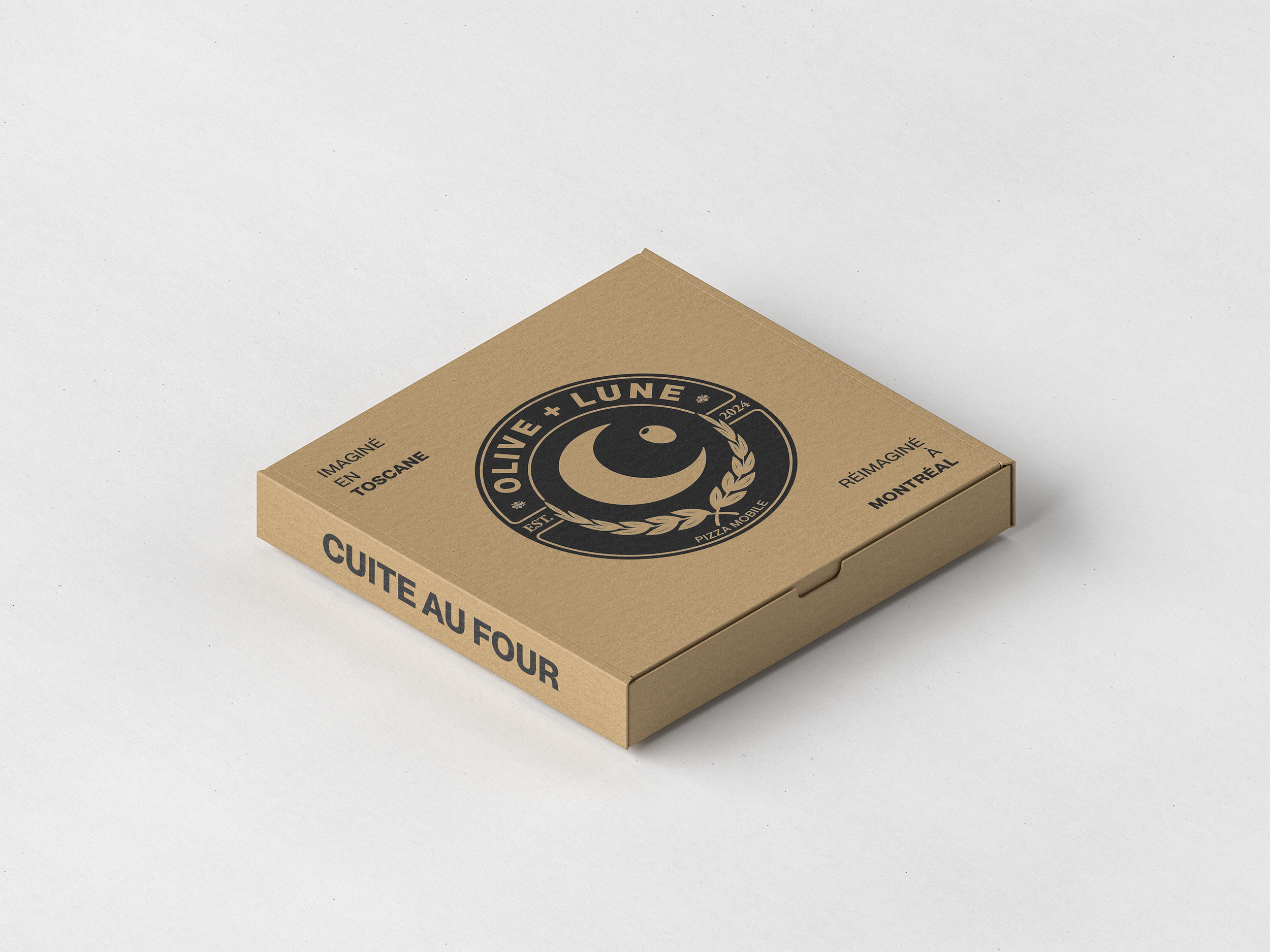
Top: Imagined in Tuscany, Reimagined in Montreal. Side: Oven baked
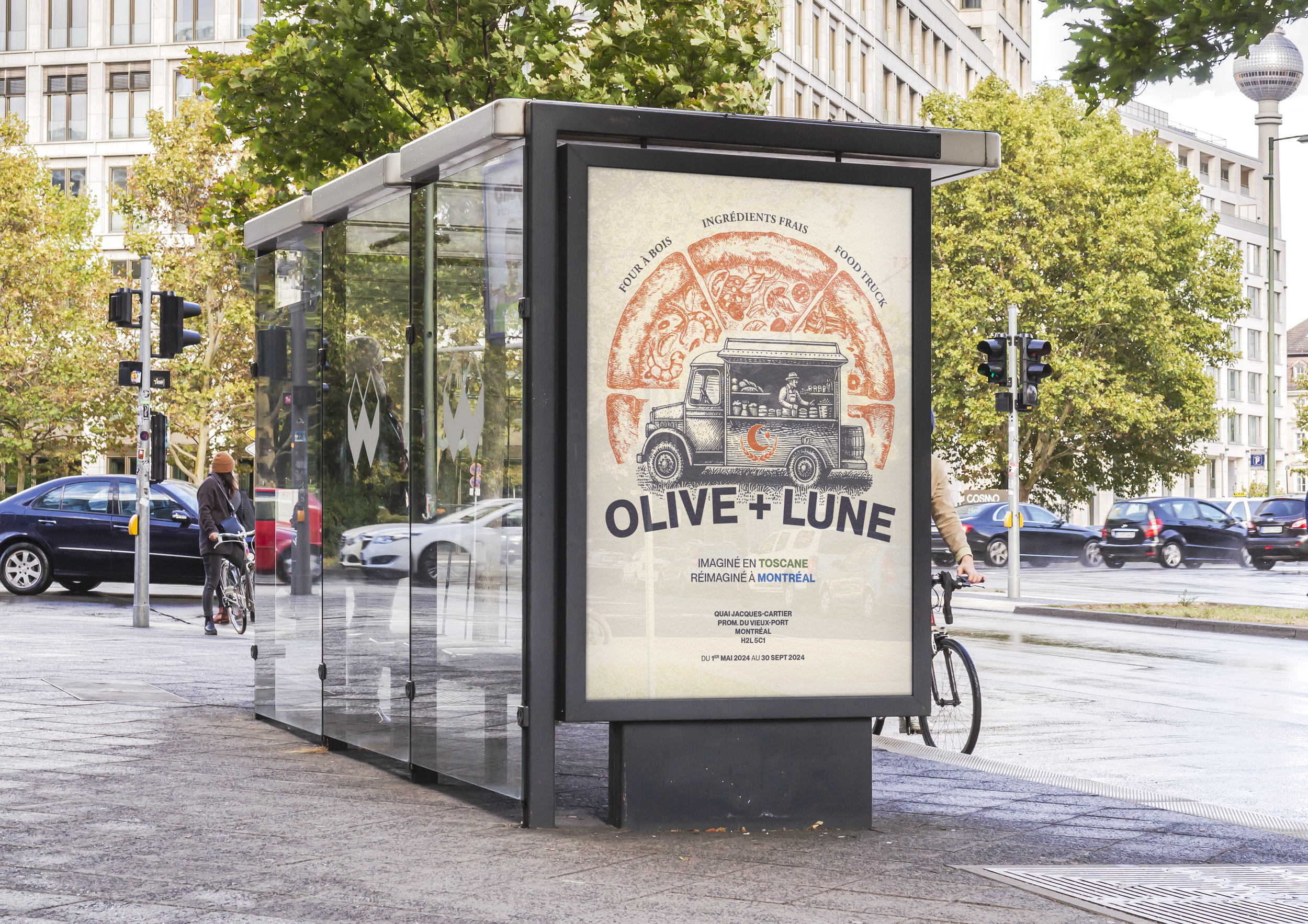
Translation (top to bottom and left to right): Wood oven, fresh ingredients, food truck (I know). Imagined in Tuscany, Reimagined in Montreal